Nov. 22, 2020
Building Pictogram Grids in D3.js
A pictogram, also called an isotype, is a type of infographic that uses icons or symbols to convey information.
The icons might be arranged in a grid or a straight line, or any other way you fancy.
In this post we will make a pictogram grid in D3.js.
Let's look at a couple of examples.
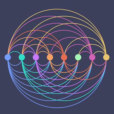
This visualization has a grid of circles for each chart, which might not be exactly what you think of as a pictogram, but it fits the main concept, which is a grid of items.
Then you can extend the concept to use other icons and make a chart like this next one that uses the Twitter icon.
This visualization has a mistake, if you can spot it!
Don't worry, we will correct it in this post.
One nice thing about using a pictogram to visualize your data, is that the icons might help your audience to better retain the information you are trying to communicate.
Pictograms can be more engaging and interesting than the average pie chart or other graph you often see.
A picture is worth a thousand words, right?
Okay, let's get to it.
Making a grid in D3.js
We're going to make a single grid like in the Twitter visualization above.
But first we will make it with circles, since circles are one of the basic shapes in SVG and we don't have to do anything special to use them.
- The full code for the grid of circles is here.
Then we will make a few changes to that code to use the Twitter icons.
- Find the code for the Twitter icon grid here.

First, draw the SVG
The SVG is the canvas for the D3.js visualization, and is one of the first things we need to define when starting to build a visualization.
If you're not familiar with SVG, short for Scalable Vector Graphics, you can read more here.
Draw the SVG and give it a width and height.
const width = 500;
const height = 500;

var svg = d3.select('#grid-chart')
        .append('svg')
        .attr("width", width)
        .attr("height", height)
        .style('background-color', svgBackgroundColor);
The grid will reside within the SVG.
How many rows and columns?
The next task is to decide on the dimensions of your grid - how many rows and columns it will have.
This will be a 10 x 10 grid, with 10 rows and 10 columns.
var numRows = 10;
var numCols = 10;
The data
The input data for this visualization is an array of 100 integers, starting with zero.
Just multiply the number of rows and columns and then generate a range of numbers.
var data = d3.range(numCols*numRows);
Picture them in this grid.
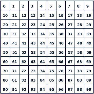
In D3.js, the input data is bound to DOM elements, which are the SVG circles.
So the 100 integers will be bound to 100 circles, and we will position them according to the grid above.
D3.js axis scales
Next we will create x and y axis scales that will be used to position the circles.
A D3.js scale is a function that maps an input to an output.
For each number in the input array, we will first calculate its row and column number in the grid.
Then we need to map those numbers to the SVG's local coordinate system.
We use the scales for that - one for the x-axis, which corresponds to the columns, and another for the y-axis, which corresponds to the rows.
    var y = d3.scaleBand()
        .range([0,250])
        .domain(d3.range(numRows));

    var x = d3.scaleBand()
        .range([0, 250])
        .domain(d3.range(numCols));
A scale needs a domain and a range, which define the scale's inputs and outputs.
So each scale takes as input a number from 0 to 9, and maps it to a number from 0 to 250.
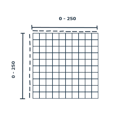
This will give us the x and y coordinates in the local coordinate system of the SVG for where to place each circle.
We will come back to this shortly.
You can read more about D3.js scales here.
Create a container for the grid
Before we worry about the circles, let's create a container to hold them.
var container = svg.append("g")
        .attr("transform", "translate(120,120)");
An SVG g element is just a container element that you can group other elements in, which in this case is the circles.
Don't worry about the line with the transform attribute for now.
D3.js data join
This is where the magic happens.
Now we will use a D3.js data join to bind the input data to the circles, and then position them to create the grid.
container.selectAll("circle")
        .data(data)
        .enter().append("circle")
        .attr('cx', function(d){return x(d%numCols);})
        .attr('cy', function(d){return y(Math.floor(d/numCols));})
        .attr('r', 12)
        .attr('fill', function(d){return d < percentNumber ? twitterFillActive : twitterFill;})
        .style('stroke', 'black');
What's going on here?
In the first few lines, we passed in the input array of 100 integers, data, that we generated earlier, and then instructed D3.js to bind a circle to each of them.
You can read more about how data joins work here.
Then we give it some attributes with .attr() and you can also assign CSS styles with .style().
The r attribute sets the radius of the circles.
Positioning the circles
The cx and cy attributes are used to position the circles in the SVG.
We will use the scales from earlier to calculate the values to assign to these attributes.
I mentioned that the input to those scales are the column and row numbers respectively, for each input number.
So now we will calculate those.
Calculate the column number
We can take the modulus (%) of the input data value and the number of columns (10) to get the column number.
For example, to calculate the column number for data value 66 would be 66%10 = 6.
Remember the count starts from zero, so column 6 will be the 7th column, if you're counting.
Look at 66 in the grid from earlier to see how it works.
Then this value is passed to the x-axis scale function, and the output is assigned to the cx attribute.
.attr('cx', function(d){return x(d%numCols);})
Calculate the row number
Calculate the row number by dividing the input data value by the number of columns and rounding down if necessary.
66 / 10 = 6.6, which rounds down to 6.
This is the input to the y-axis scale function, and the output is assigned to the cy attribute, in this line:
.attr('cy', function(d){return y(Math.floor(d/numCols));})
Colors
We are visualizing 92 percent in this grid, so 92 circles will have one color and then the remaining circles with have another color.
The color is set with the fill attribute, which is assigned in this line:
.attr('fill', function(d){return d < percentNumber ? twitterFillActive : twitterFill;})
The variables used here were defined earlier in the code.
var percentNumber = 92;

var twitterFill = "#4D908E";
var twitterFillActive = "#adf7b6";
So it fills in each circle with one color if its data value is less than 92, and another if it is greater than or equal to 92. (Remember the input data starts with zero).
I mentioned an error in the code for the Twitter pictogram - one color is filled in for less than or equal to 92, which is why there are 93 icons filled in with the first color.
But we've fixed that here.
Pictogram with Icons
To create the grid with the Twitter icons, we just need to make a few changes to the code for the circle grid.
We're not using the built-in SVG circles, so we will have to create the shape ourselves by defining an SVG path.
First we have to create an SVG defs element to hold the path of the Twitter icon, which you can see in the code.
I'm not going to copy/paste that part here because it's a bit long.
The icon came from Iconscout, and I just took the path data from the SVG file.
We've assigned the defs element an id of twitterIcon, which we will use to refer to it in the data join block.
The data join code will look a bit different.
container.selectAll("use")
        .data(data)
        .enter().append("use")
        .attr("xlink:href", "#twitterIcon")
        .attr("id", function(d){return "id"+d;})
        .attr('x', function(d){return x(d%numCols);})
        .attr('y', function(d){return y(Math.floor(d/numCols));})
        .attr('fill', function(d){return d < percentNumber ? twitterFillActive : twitterFill;})
        .style('stroke', 'black');
Instead of circles, we are selecting and appending a use element to clone the icon and use it for each of the input data items.
Read more about use here.
Then we link to it with the id that we assigned to the defs element, in this line:
.attr("xlink:href", "#twitterIcon")
And instead of cx and cy positioning attributes, we just use plain old x and y.
So the main changes were creating the path for the Twitter icon and then using it, which might be a bit confusing if you're new to working with SVGs.
Multiple charts
To create the first visualization in this post, I just created three separate containers like we created for the single grid in this post and positioned them in the SVG.
var container = svg.append("g")
        .attr("transform", "translate(120,120)");
And the transform attribute can be used to move the container around to position it in the SVG.
Read more about transform here.
D3.js grid tips
I would suggest playing with the code for the grid we created in this post, and tweaking different values to see what happens and how the grid changes.
If you're creating a grid like this one, you might want to tweak the values of the scales when you create them - specifically the range values, which basically make up the width and height of the grid within the SVG.
The width and height of the SVG is 500, and then the ranges of the axes are 250, so try changing the ranges to [0,500] to see what happens, or just change one of the axes and see how it looks.
Thanks for reading!
If you have any questions or comments, write them below or on Twitter @LVNGD.
And if you make any pictogram grids, I definitely want to see them!