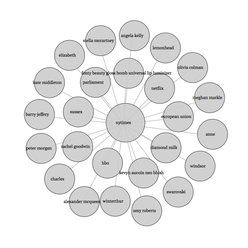
What is a Force-Directed Network Graph?
- A network graph is a collection of nodes and the links that connect them.
- In our graph the nodes are circles and the links are the lines connecting the circles.
- A force-directed graph uses forces that work on the nodes and links to move them around to create the structure here and make it visually pleasing.
- The forces can be attractive and repulsive, and we use both in this graph.
- A network graph is a really versatile type of visualization - all kinds of things can be modeled with a graph.
- You can read more about force-directed graphs here.
Nodes
The nodes can be any data object, containing any data variables you want, as long as each item has a unique id.
Node data
[{"id": "0", "name": "nytimes", "count": 0, "category": 0},
{"id": "1", "name": "hbo", "count": 1, "category": 1},
{"id": "2", "name": "fenty beauty gloss bomb universal lip luminizer", "count": 1, "category": 1},
...]
- Notice the id number for each node. The first node with id "0"(zero) is our article source for this graph, the New York Times. That will be the center of this graph, with all other nodes connecting to it.
- The name variable is the entity name and what will be displayed on the circle.
- The category variable designates whether it is an article source node(in this case the NY Times) or an entity from the articles.
- The count variable is a count of how many times the entity was mentioned in the articles.
Links
The links contain data for each pair of nodes - the source and target - that should be connected in the graph.
Link data
[{"source": "0", "target": "1", "value": 1, "count": 1},
{"source": "0", "target": "2", "value": 1, "count": 1},
...]
- Here is an example of the link data with a couple of links, both with the source node "0"(zero) which, as we see above, corresponds to the New York Times' node.
- These links connect the New York Times node to the "hbo" and "fenty beauty gloss bomb universal lip luminizer" nodes which you can see by the link target that the ids correspond to those nodes.
- The count variable is just a count of how many times each entity appeared in the articles. It will be used later.
- I gave them number ids, but you could make the ids words or anything you want. They just need to be unique for each node. The id is a key for the link to identify the nodes to connect.
Create the graph
We start off with an HTML outline.
<!DOCTYPE html>
    <head>
        <meta charset="utf-8">
        <script src="https://d3js.org/d3.v4.min.js"></script>
    </head>

<body>
    <div id="networkGraph"></div>

</body>
<script></script>
</html>
- I'm using D3.js version 4.
- The graph will be created in this div:
<div id="networkGraph"></div>.
- The JavaScript code we write will go in the script tag above the closing
</html> tag.
A preview of what happens next
- Create an SVG container to hold the graph.
- Define the simulation forces that will act on the lines and circles - the link and node data.
- Draw the lines, circles and labels.
- Start the simulation.
Create the SVG container
const width = "960";
const height = "600";

const sourceRadius = 45;
const entityRadius = 35;

var svg = d3.select("#networkGraph")
    .append("svg")
    .attr("width", width)
    .attr("height", height);
I defined some constants here for the width and height of the SVG, and also defined the radius for the source nodes and the entity nodes.
In the graph you can see that the circles for the entities have a smaller radius than the circle for the article source, the NY Times.
Define the force simulation
var simulation = d3.forceSimulation()
    .force("link", d3.forceLink().id(function(d) { return d.id; }))
    .force('charge', d3.forceManyBody()
      .strength(-1900)
      .theta(0.5)
      .distanceMax(1500)
    )
    .force('collision', d3.forceCollide().radius(function(d) {
            return d.radius
          }))
    .force("center", d3.forceCenter(document.querySelector("#networkGraph").clientWidth / 2, document.querySelector("#networkGraph").clientHeight / 2));
We have a few forces here that each will work on the nodes and links to move them into place and create the graph layout.
- The "link" force identifies which link the force is acting on by the link id.
- The "center" force pulls the nodes to the center - in this case to the center of the
#networkGraph div.
- The "collision" force aims to make sure the nodes do not overlap, and in this case it is based on the radius of the circle since our circles are not all the same size.
- The "charge" force - I had to go by trial and error to find the right values for strength, theta and distanceMax for my project. This force keeps the nodes separate from one another.
Draw the SVG lines from our link data
These are the lines between the circles in our graph that link the circles together.
var link = svg.append("g")
    .selectAll("line")
    .data(graph.links)
    .enter().append("line")

link
    .style("stroke", "#aaa");
An SVG line element is created for each link object in our data.
I added some styling. The "stroke" is just the line color.
Side note on D3.js concepts
If you're unclear what is going on so far with the code to draw the links - which will be similar to the next pieces of code to draw the nodes and labels - you will want to read more about data joins in D3. Here is a good post explaining data joins, written by the creator of D3.js, Mike Bostock.
Draw the SVG circles from our node data
var node = svg.append("g")
    .attr("class", "nodes")
    .selectAll("circle")
    .data(graph.nodes)
    .enter().append("circle")
            //I made the article/source nodes larger than the entity nodes
        .attr("r", function(d){return d.category==0 ? 45 : 35});

node
    .style("fill", "#cccccc")
    .style("fill-opacity","0.9")
    .style("stroke", "#424242")
    .style("stroke-width", "1px");
An SVG circle element is created for each node object in our data.
This is where the category variable from the nodes data comes in.
I have two categories in this data - 0(zero) and 1, corresponding to either nodes representing article sources as category 0(zero), and nodes representing entities from the articles as category 1.
The radius for category 0(zero) is 45 while other categories(in this case only one other category, 1 for the entities) are 35.
Draw the labels
var label = svg.append("g")
    .attr("class", "labels")
    .selectAll("text")
    .data(graph.nodes)
    .enter().append("text")
    .text(function(d) { return d.name; })
    .attr("class", "label")

label
    .style("text-anchor", "middle")
    .style("font-size", "10px");
An SVG text element is created for each node object in our data, and it uses the name variable from the node object to assign the text content to display.
Back to the simulation
Where things fall into place.
Define the simulation tick functionality
Each 'tick' in the simulation moves the graph towards the desired layout and invokes the forces that we defined in our simulation earlier, computing the new x and y coordinates for each circle, line and label.
The simulation starts automatically, but you can also stop it and restart it.
You can read more about what the tick functionality is doing in the docs.
function ticked() {
    link
        .attr("x1", function(d) { return d.source.x; })
        .attr("y1", function(d) { return d.source.y; })
        .attr("x2", function(d) { return d.target.x; })
        .attr("y2", function(d) { return d.target.y; });

    node
         .attr("cx", function (d) { return d.x+5; })
         .attr("cy", function(d) { return d.y-3; });

    label
        .attr("x", function(d) { return d.x; })
        .attr("y", function (d) { return d.y; });
    }
This is our tick handler and it is responsible for keeping track of the state of our layout and re-drawing the circles and lines in their new x and y coordinates. This happens many times until the layout is complete.
When you first load the page, you can see the circles and lines moving around as the simulation guides them into place.
Start the simulation
simulation
    .nodes(graph.nodes)
    .on("tick", ticked);

simulation.force("link")
    .links(graph.links);
This is where the ticked function is called and the simulation starts.
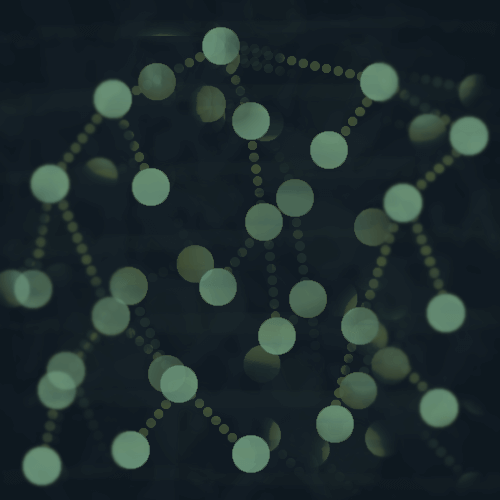
Here's what it looks like so far
After adjusting the font-size, some of the labels are a bit hard to read, but we can add some tooltips to remedy this.
Tooltips
- In this graph, some of the labels have very small text that most people can't really see.
- We will simply add a tooltip so that the user can hover over each circle and view the entity name in the tooltip.
First, define the tooltip
var tooltip = d3.select("body")
    .append("div")
    .style("position", "absolute")
    .style("visibility", "hidden")
    .style("color", "white")
    .style("padding", "8px")
    .style("background-color", "#626D71")
    .style("border-radius", "6px")
    .style("text-align", "center")
    .style("width", "auto")
    .text("");
We defined a div element here with absolute position that we will populate with text when we trigger the mouse events that we will define next.
Add mouse events to the labels and also to the nodes
label
    .on("mouseover", function(d){
                tooltip.html(`${d.name}`);
                return tooltip.style("visibility", "visible");})
    .on("mousemove", function(){
        return tooltip.style("top", (d3.event.pageY-10)+"px").style("left",(d3.event.pageX+10)+"px");})

node
    .on("mouseover", function(d){
                tooltip.html(`${d.name}`);
                return tooltip.style("visibility", "visible");})
    .on("mousemove", function(){
        return tooltip.style("top", (d3.event.pageY-10)+"px").style("left",(d3.event.pageX+10)+"px");})
    .on("mouseout", function(){return tooltip.style("visibility", "hidden");});
- I've added
mouseover and mousemove events to the node and label because they are separate entities in this graph and both need the events added to them.
- The tooltip div container moves to the coordinates specified as we move the mouse, and populates the "name" variable from the circle or label that we hover over.
- I also added a
mouseout event to the nodes so that the tooltip will disappear when the mouse moves out of the circle.
Here is the updated graph with tooltips
Hover over the circles to see the them.
And finally, a gradient fill for the circles.
Gradient fill background
- A gradient background will give the circles some depth and is more interesting than a plain gray background.
- Adding a gradient to an SVG element is not as simple as defining a gradient in CSS.
- We have to create a definition for the gradient before we can add it to our elements.
First we append a defs element to our SVG.
var defs = svg.append("defs");
This element tells SVG that it is a resource and not a regular element, so we need to apply it to another element in order to see it. We will be applying it to the nodes - the circles in the graph.
I'm creating two different gradients with one for the article/source node(NY Times) and the other for the target/entity nodes.
The gradient for the article/source node
defs.append("radialGradient")
    .attr("id", "source-gradient")
    .selectAll("stop")
    .data([
            {offset: "20%", color: "#eda515"},
            {offset: "100%", color: "#827777"},
        ])
    .enter().append("stop")
    .attr("offset", function(d) { return d.offset; })
    .attr("stop-color", function(d) { return d.color; });
The stop element defines a color and its offset or position in the gradient.
This one is a radial gradient, with an orange center - #eda515 and the rest of it is a grayish color #827777.
I gave it an id of "source-gradient" which will be used to apply it to the node later.
This gradient is used for the article source node, which in this graph is the New York Times node.
The gradient for the entity/target nodes
defs.append("radialGradient")
    .attr("id", "entity-gradient")
    .selectAll("stop")
    .data([
            {offset: "50%", color: "#ffffff"},
            {offset: "100%", color: "#CCCCCC"},
        ])
    .enter().append("stop")
    .attr("offset", function(d) { return d.offset; })
    .attr("stop-color", function(d) { return d.color; });
This is another radial gradient with an id of "entity-gradient".
This gradient will be applied to the entity nodes in the graph.
Add the gradient to the node styling
node
    .style("fill", function(d){return d.category==0 ? "url(#source-gradient)" : "url(#entity-gradient)"});
And there you have it!